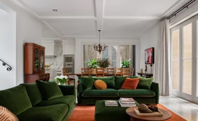
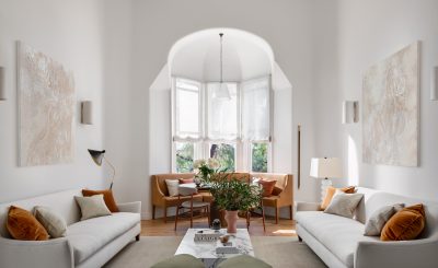
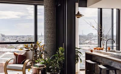
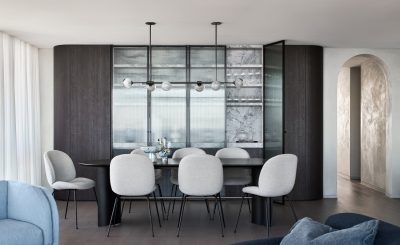
7 Days of Paint Styling

interior design firms London

This last week has been the 7 Days of Paint Styling,

and here is your official re-cap!

Day One was about colour, and specifically all about paint. It’s hard with all the combinations of colour that are continually invented, to make up your mind! Our tip is to do some personal research, get inspired! View our Pinterest Board below to get inspired! Click the image below to see more!

7 Days of Paint Styling event 1st day

Day Two we celebrated the smooth texture & the colour soothing trend by Dulux called: Sentience. This 2017 tactile remedy moves away from highlighting cold surfaces by adding warmth in fleshy tones and vegetal hues. Using colours such as Pragmatic, Tavern, Vintage Beige or even Parchment Paper not only turns the spaces into warm living areas, but compliments the natural lighting of the home. Always look to the natural lighting of a room to be sure if the paint decisions are going to work. If you use light colours against harsh lighting, the space could become washed out & lost – the same vis versa, dark walls in a windowless room will be very gloomy.

interior decorating
Day Three of the 7 Days of Paint Styling by The Stylesmiths is all about complimentary colours, you’ll love this if you’re all about bursts of colours! The classic colours you can match are rich reds and greens, pops of golden-yellow with black sea navy, or keeping it warm with burnt oranges matched with brown or burgundy. But if you’re feeling a little bolder, which we hope you are, it’s easy to match lighter pastels with darker green compliments – one of our favourite examples, and products, is from Belle Magazine called Plush Hour, known as a “feast for the senses.” The feature colour is @porterspaints Black Sea feature wall, complimented with products like the Lektor Floor Brass Lamp by Rubn Lighting, &Tradition True Colour Vase, the Dreamer Velvet Couch by Pop and Scott, and the gorgeous clear-sky blue Amelia armchair in ‘Kong’ fabric.
This colour combo is a modern-design-styling-epic-dream come true, and the colours although not normally matched on a colour wheel, are proud, complimentary, and absolutely heavenly. What do you think of matching colours that don’t normally relate?
interior decorating
Day Four texture, movement, and finishes when it comes to our 7 Days of Paint Styling. Have you ever played with the texture of your paint, because it makes for an interesting interior addition when styling your home. The textures of a rough wall, with a glossy finish, or vis versa a smooth wall with a matte finish. Whatever the choice, it’s going to reflect your style – so take into consideration what you want do with your paints. If you’re looking to add colour, with a simple matte finish, test the paints on the wall. Another tip, which we advice by, is to explore your options with sample tins. They won’t set you back too much, and that way you can explore the endless possibilities when designing with your partner, or designers, the best options for you!
Remember to stay creative, trust your intuition, and seek help where you need it – paint, colour, and texture make such a fantastic combination and can really enhance the dimensions of your spaces.
using different materials to represent new texture level
Day Five we showcased one of our projects called the Blairgowrie Beach House by Stylesmiths Stef. This project was influenced by the natural elements of the beach in which the house surrounds, and the best part is that the colour choices of paint reflect the style of the home. Featuring Bluish Water – colour by @dulux, TIP 5 is to match colour with accessories and furnishings, because when you do, you can create incredibly stylish spaces! This project brings natural light timbers into the space, reflecting the soft sand between your toes, a selection of light blues through to deep sea ocean navy, emphasising the ocean’s many shades, and soft creams or white furniture to compliment the living areas.
With paint selections also comes a responsibility to envision the whole space, which absolutely includes the furniture and accessories! This is one of our favourite Scandinavian/Australian interior designed homes, what do you think of the colour matches with furniture and accessories? We’re obsessed!
interior decorating
Day Six was about a method we use when painting & thinking about dimensions. How we can achieve add dimensions to a space is by adjusting the strength of paint when on the walls, the corners of the space also know as the architraves, and the ceiling too! Adding dimension is achieved when you either lower the strength to half or even a quarter. You can also do this with colour!
Another trick is adding geometry to the walls, with different opacity levels. Shape sounds scary, and blocking out colours in different sizes might take some time, but when you give the wall detail with coloured ombre styling, perhaps in triangular shapes or honeycomb hexagons, a space can totally transform! How have you experimented with dimensions in your space?

Day Seven our last day is all about planning, and thinking about how you’re going to live in the space! If you have kids that could potentially take to the walls, use a paint that will wipe aware marks easily. Buy tape, the appropriate equipment like a stand, rollers, paint buckets, floor coverings, the lot – and have fun, always have fun!

Related Posts